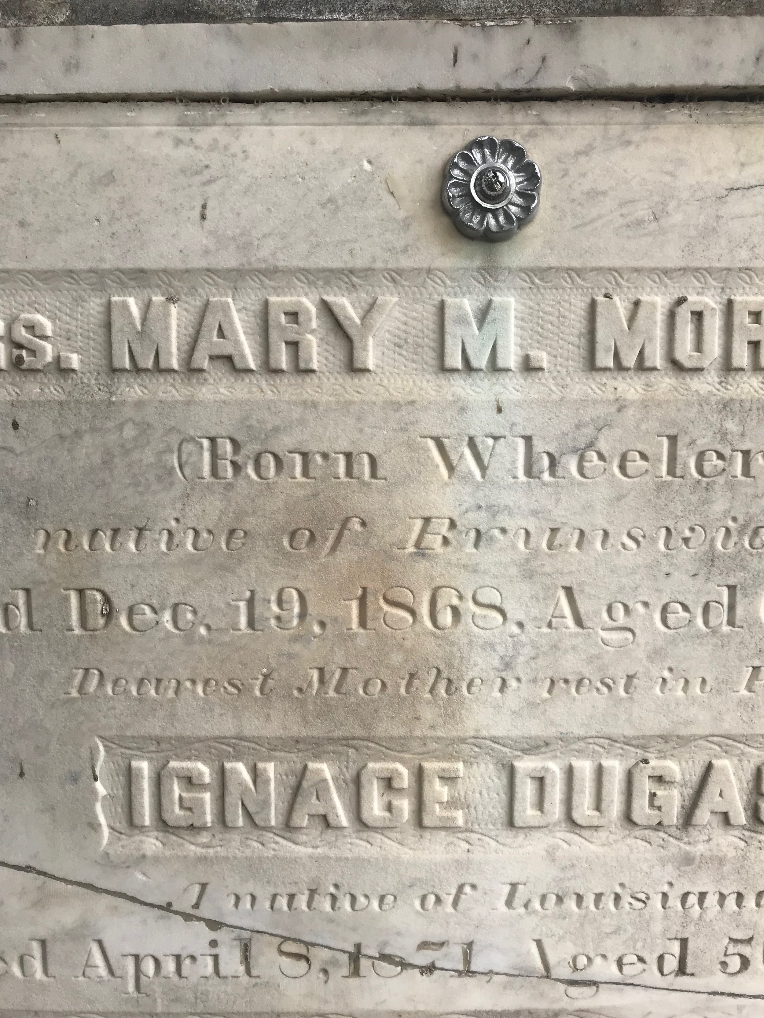
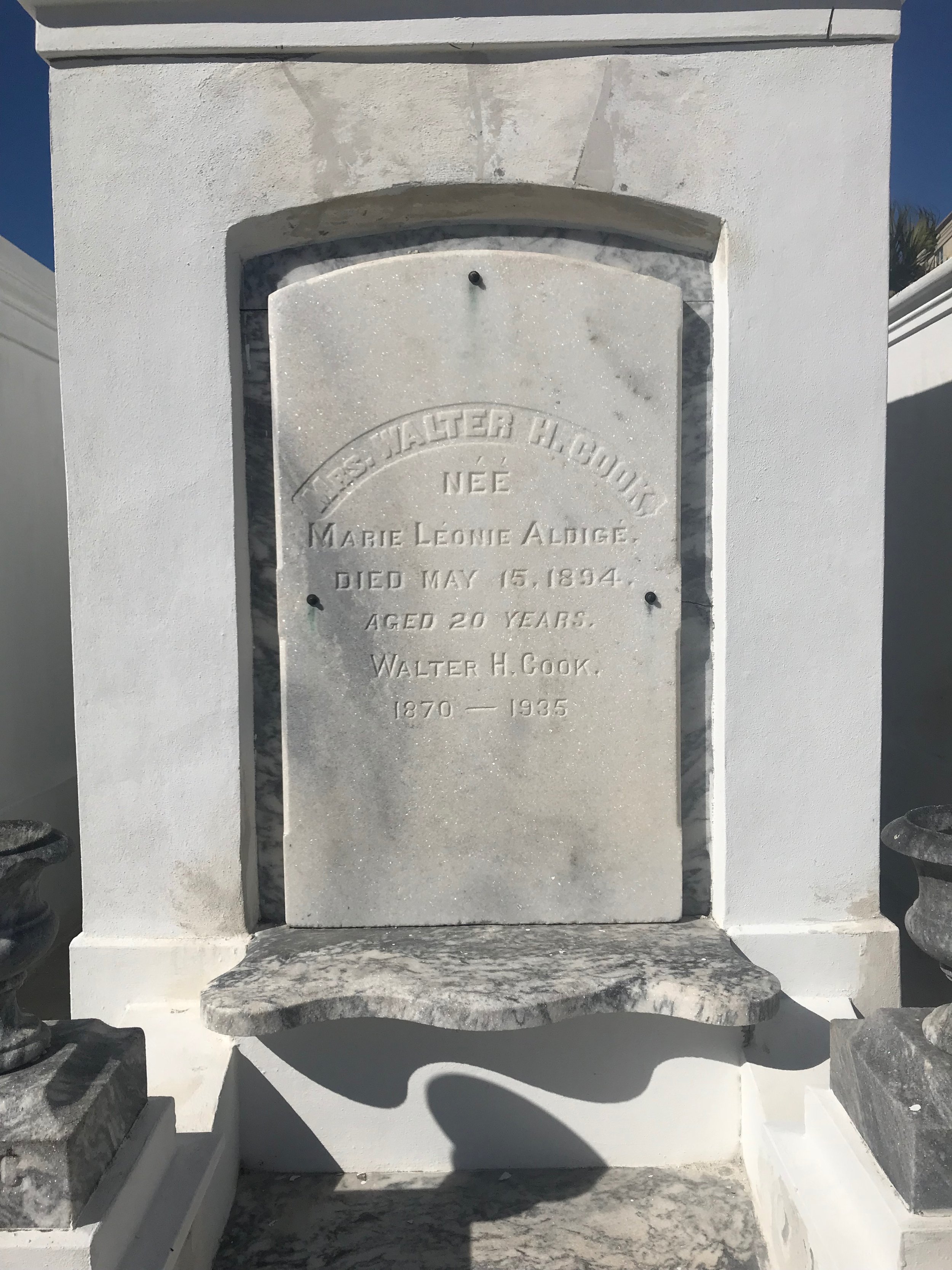
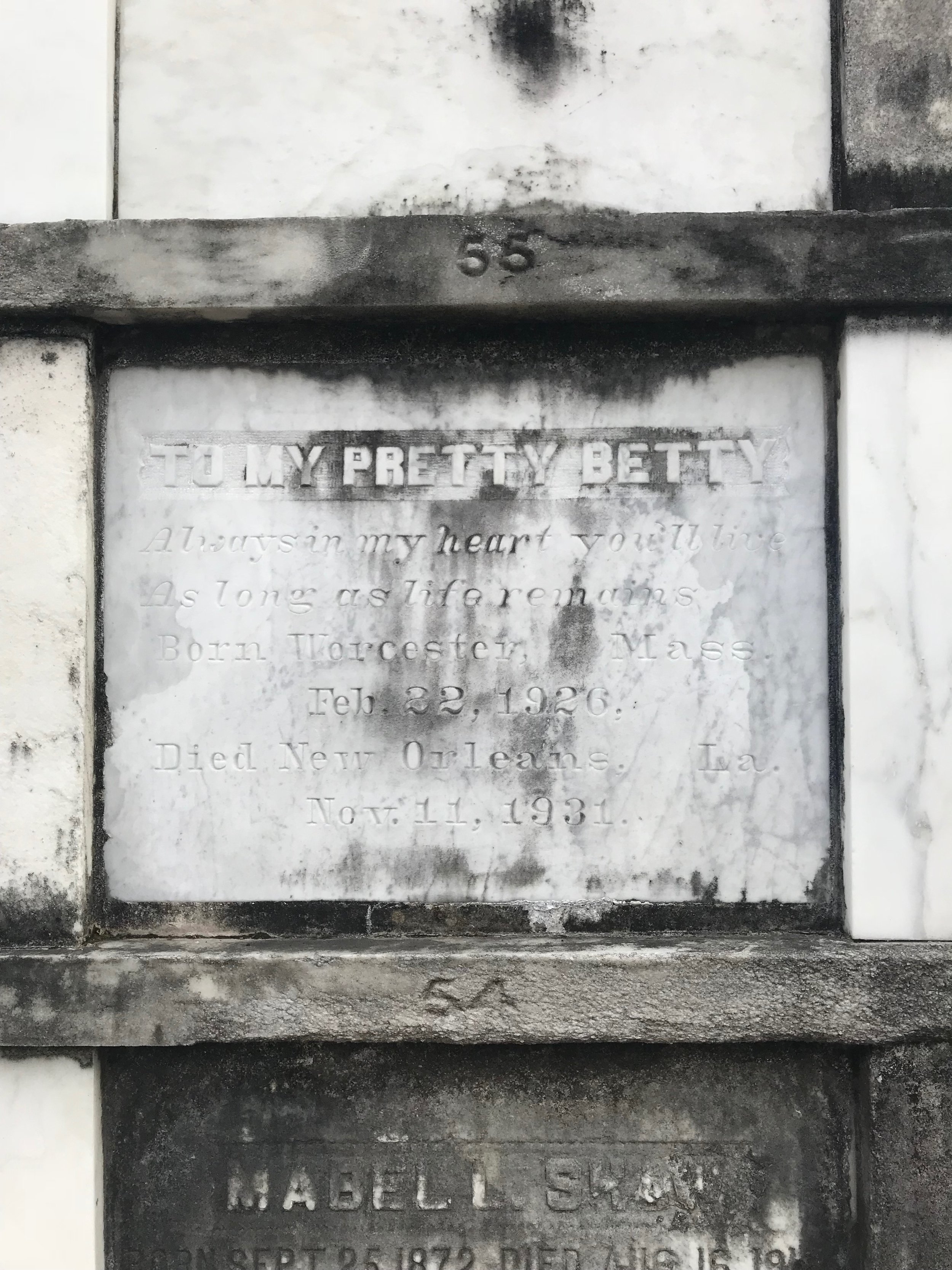
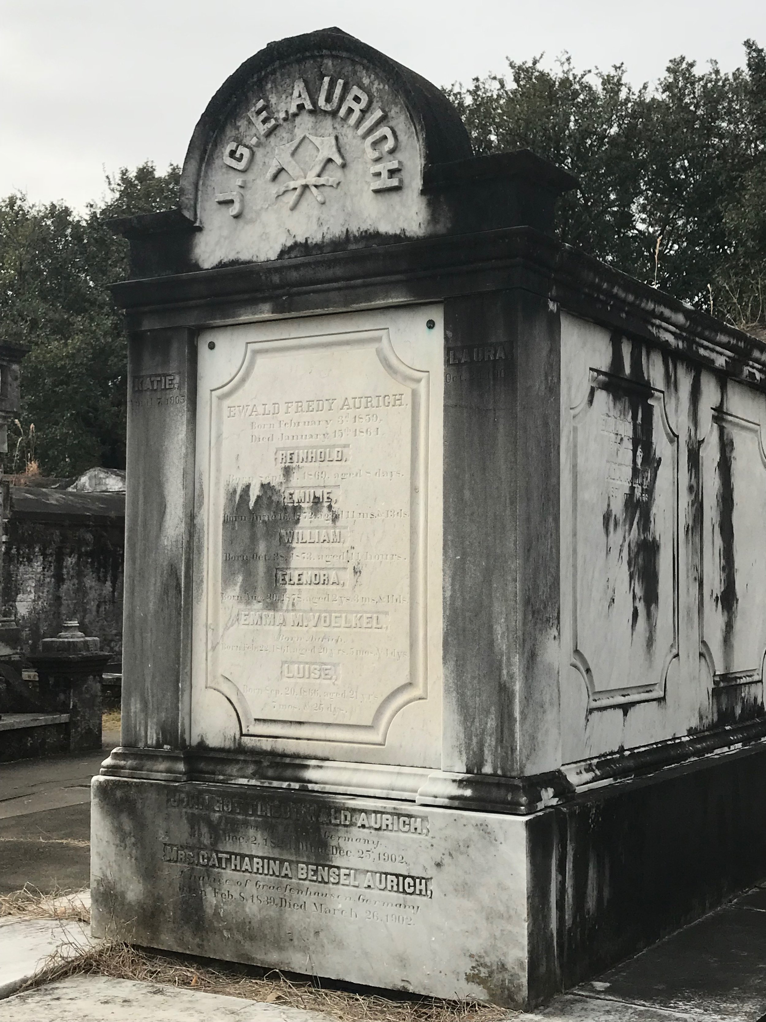
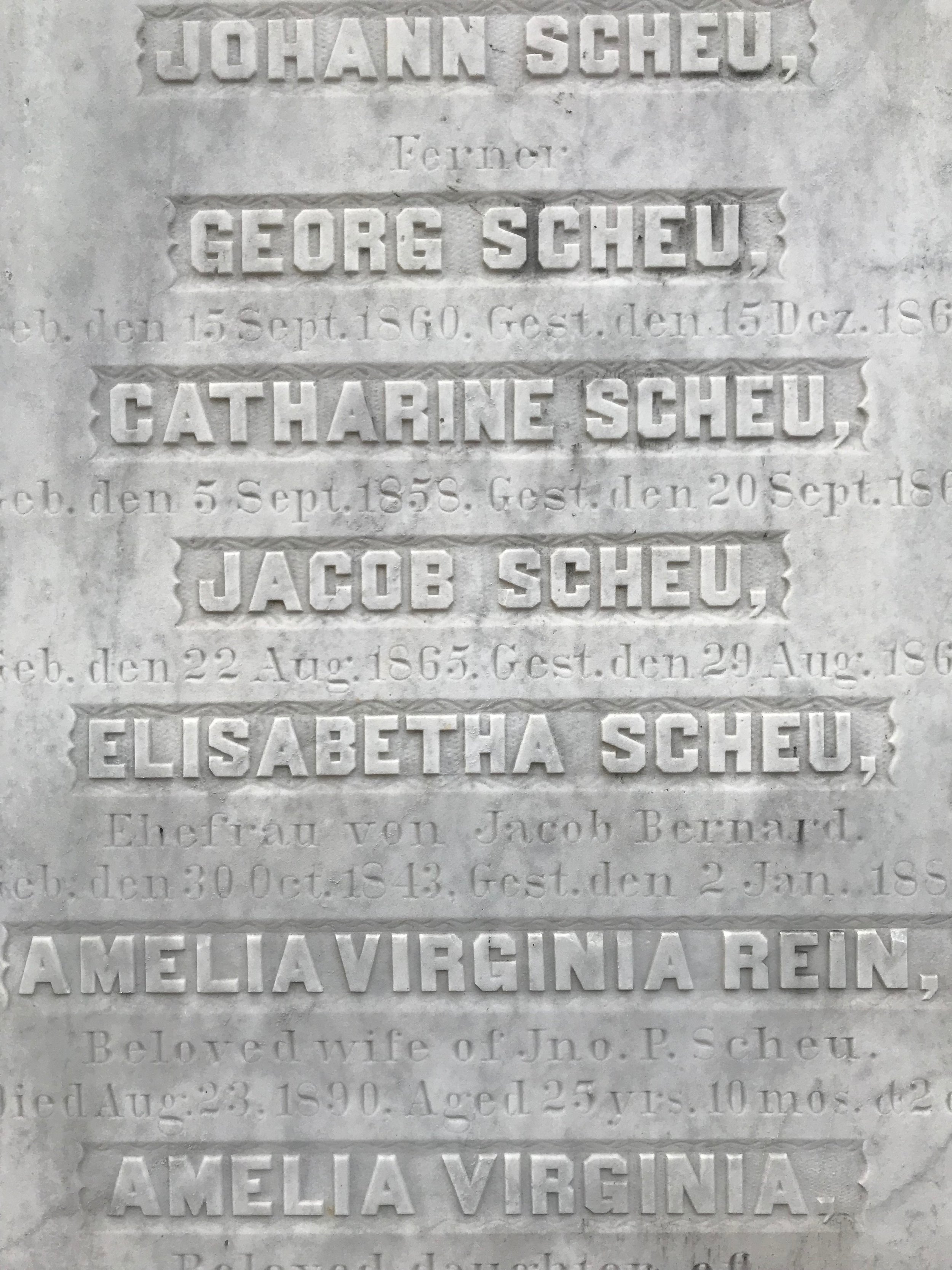
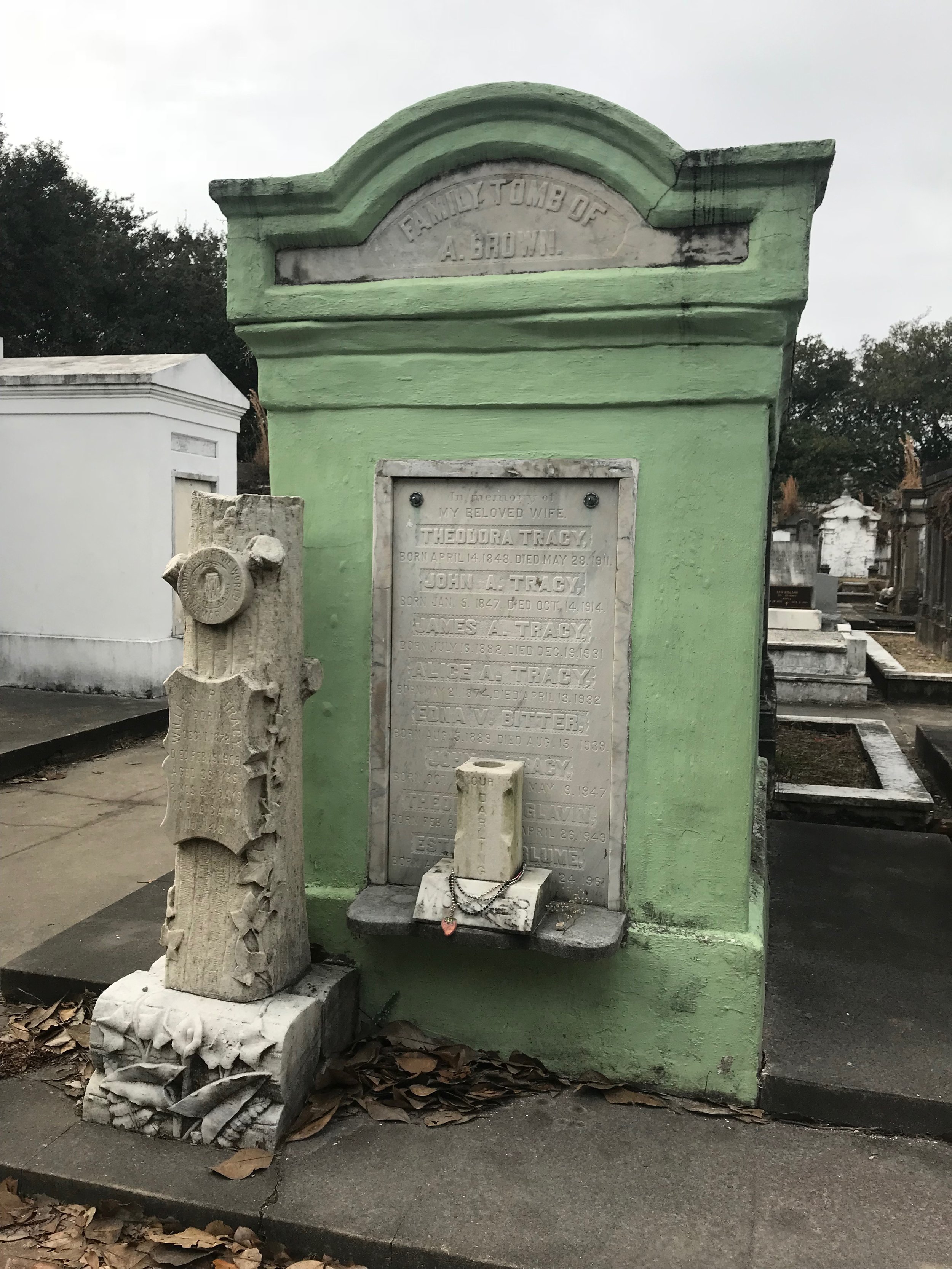
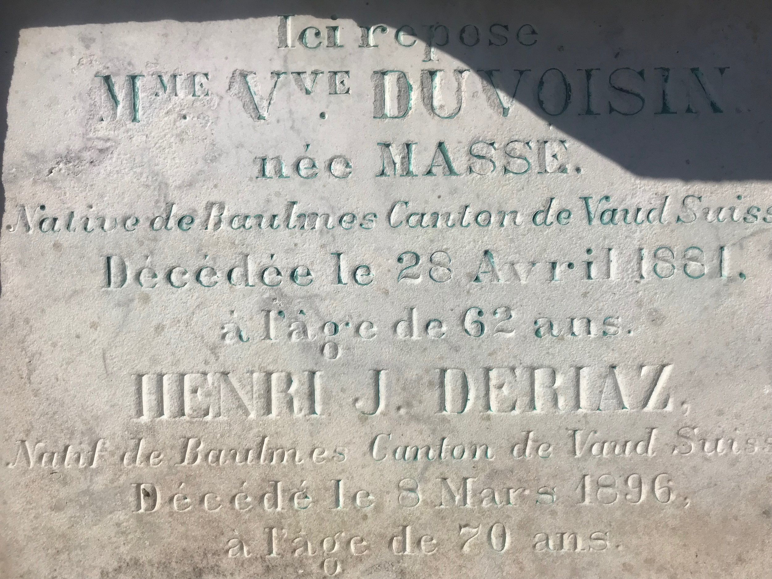
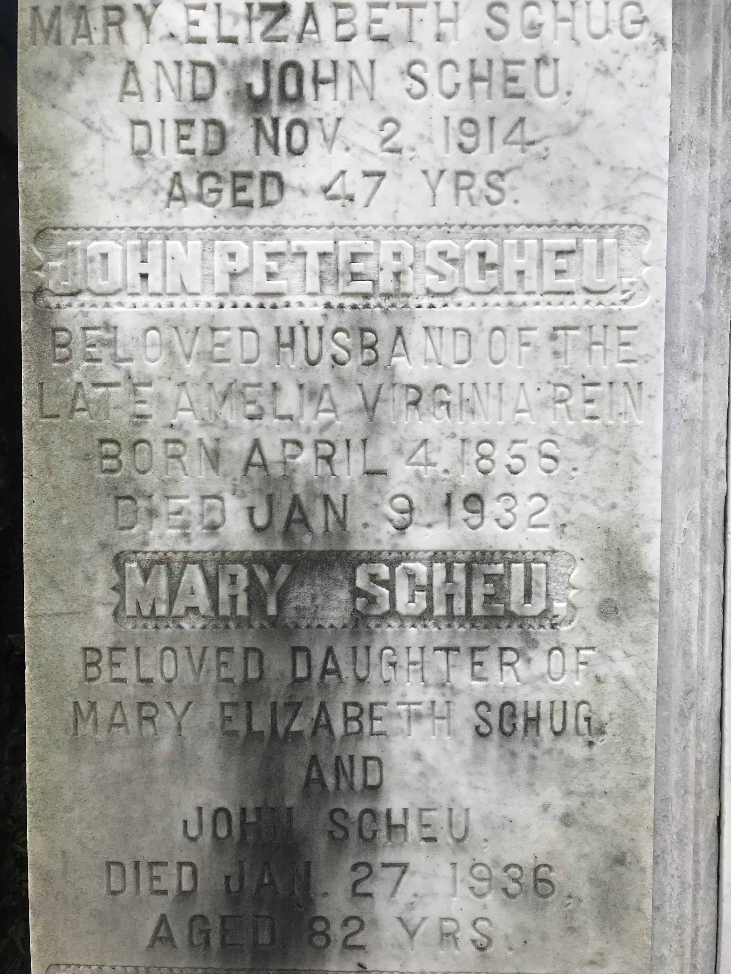
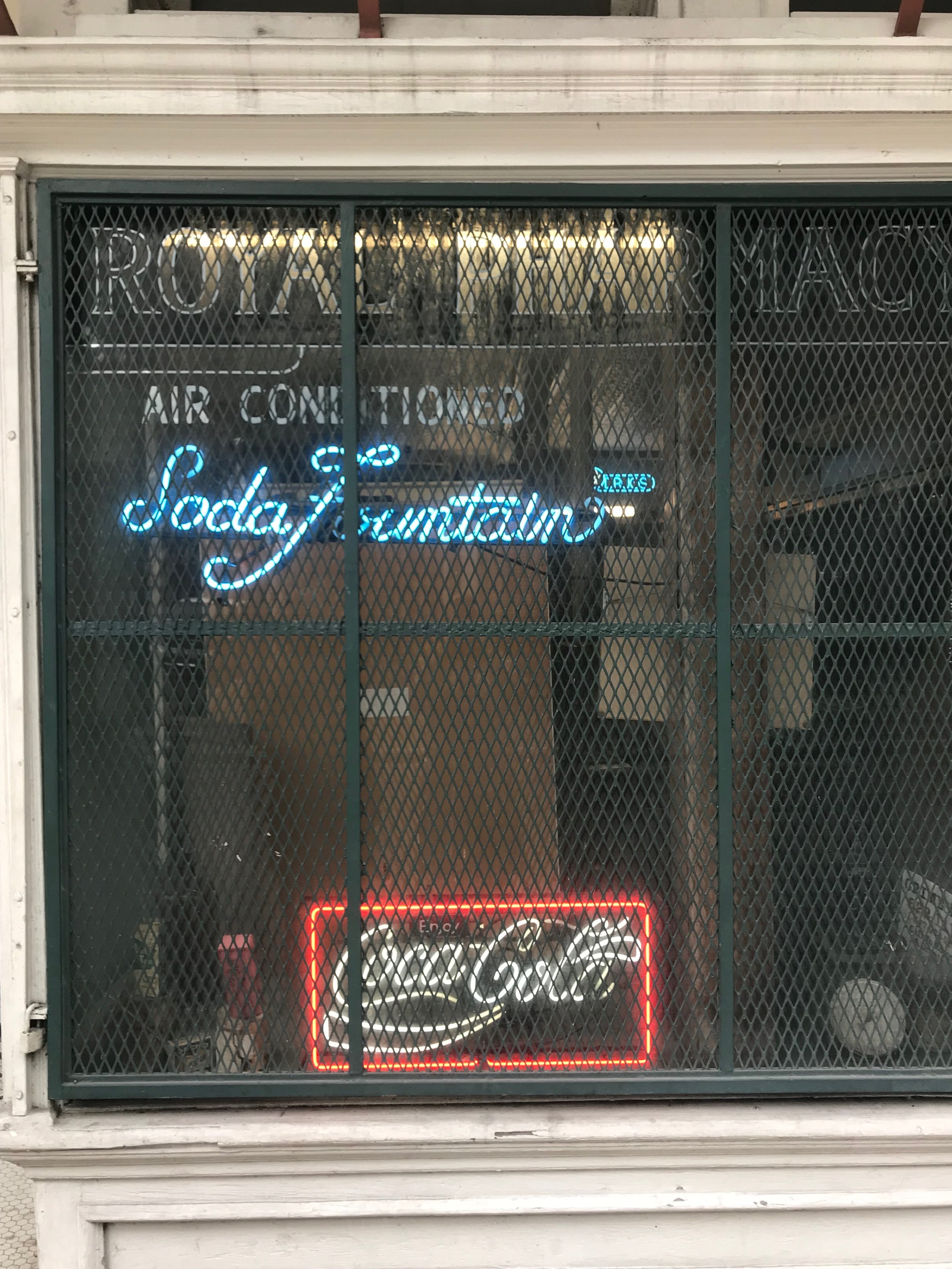
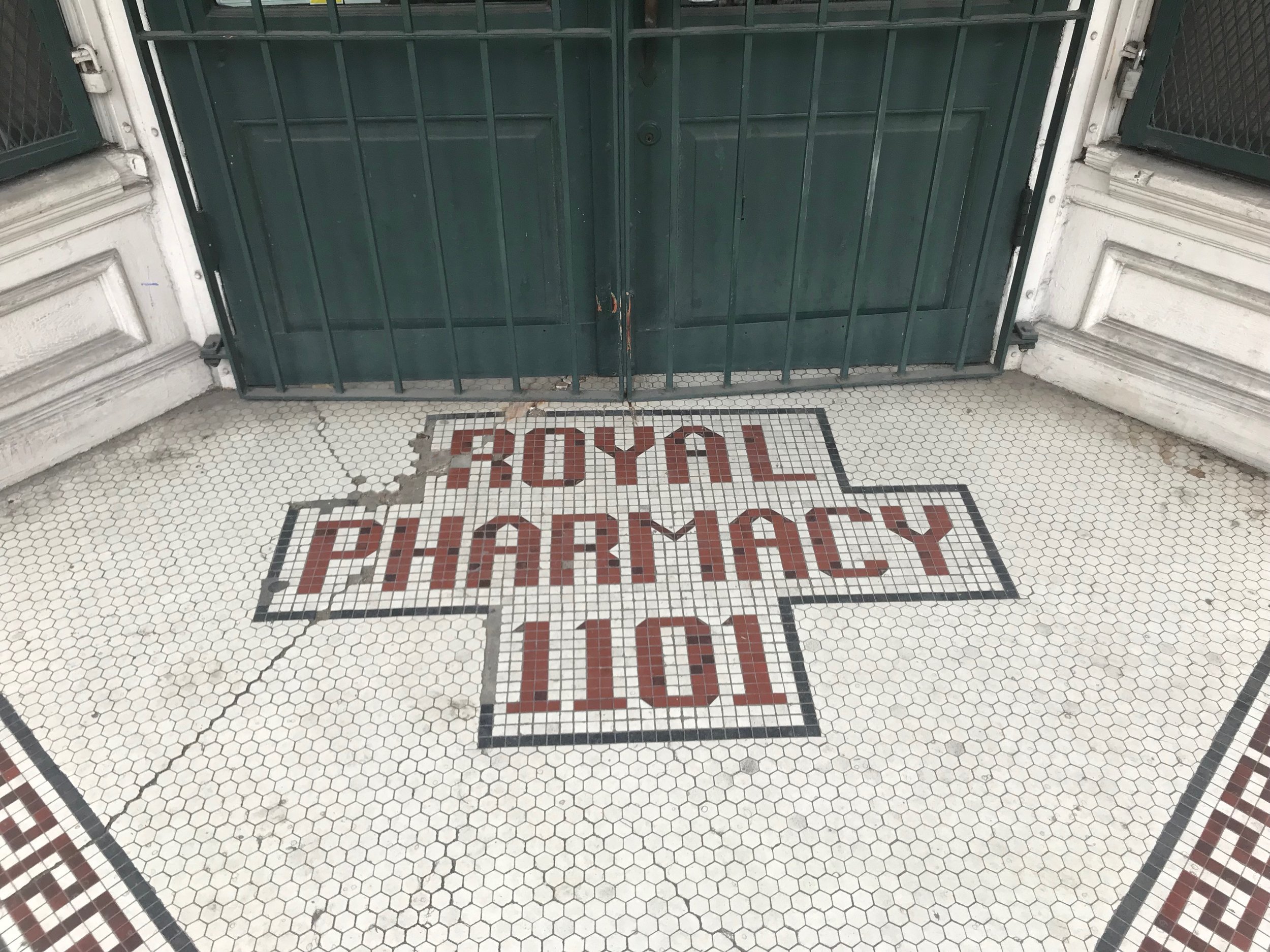
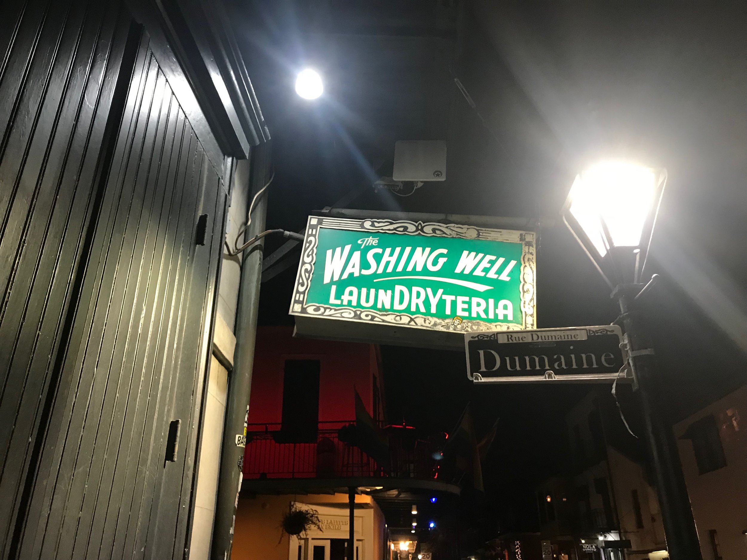
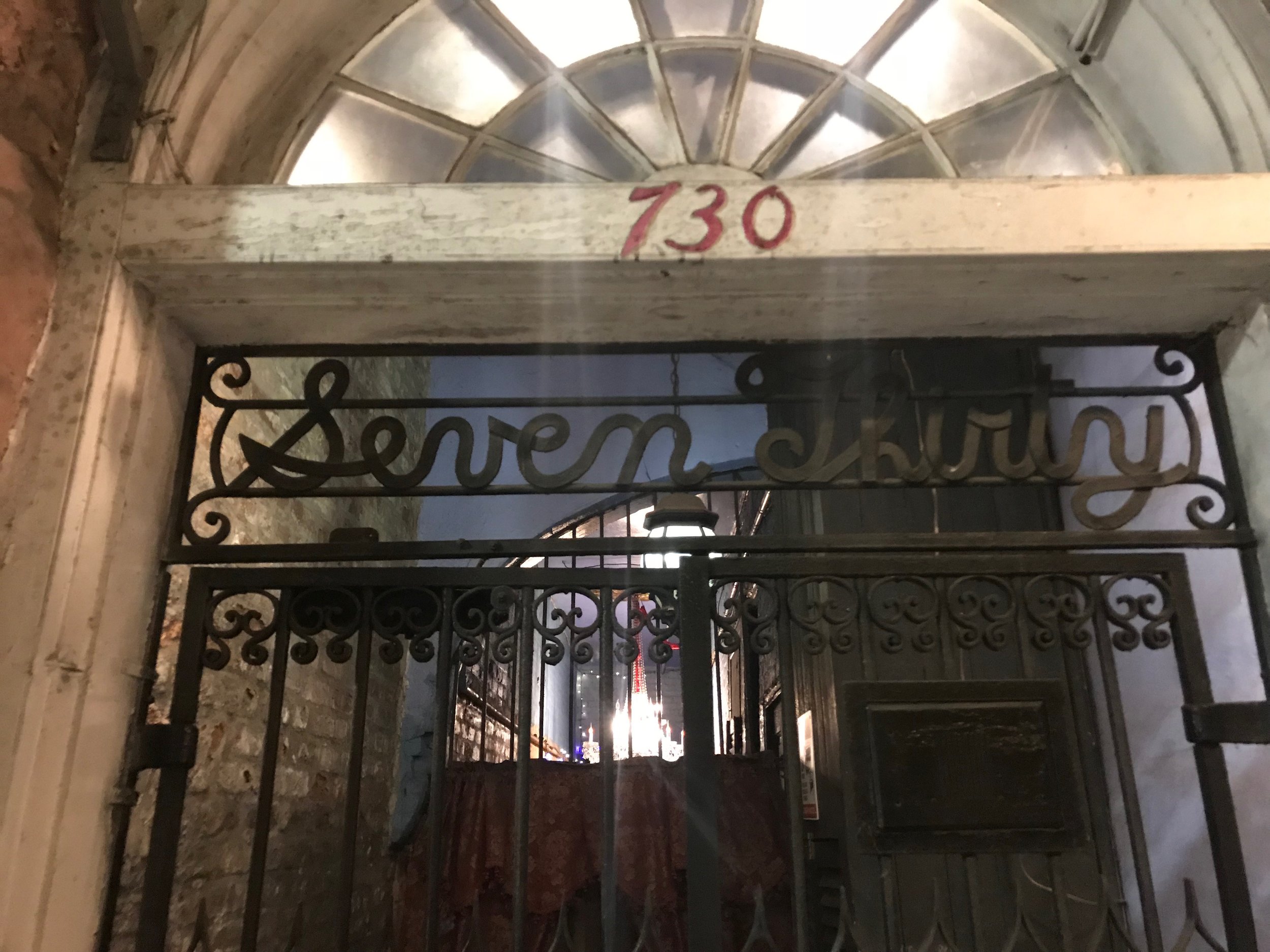
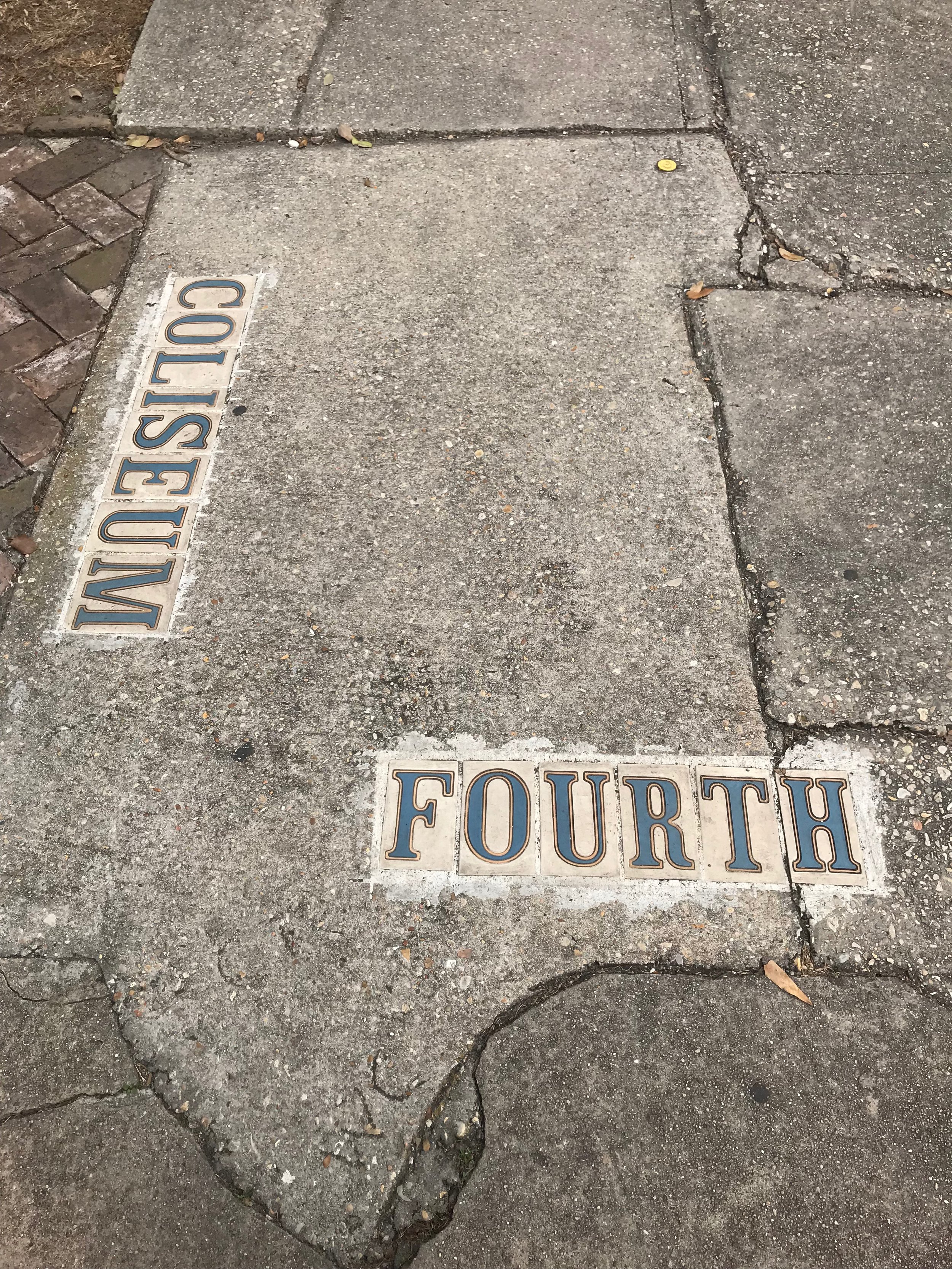
Talk about preserving typographic history! The above ground tombs are as synonomous to New Orleans as Mardi Gras. I was initially interested in seeing them for their historical value but was not prepared for how beautiful and variating the typographic display would be. The skilled engravings of these craftsman of yesteryear have such grace in their simplicity. With most of the original tombs I saw being dated way before computers, it makes you wonder where one would have learned the precision of so many different typefaces. Or how long it took to learn a craft such as this with just a stone and chisel. It would be amazing to step back in time to see how this craft was taught.
Disclaimer: These photos are all from a visit to New Orleans in January 2018
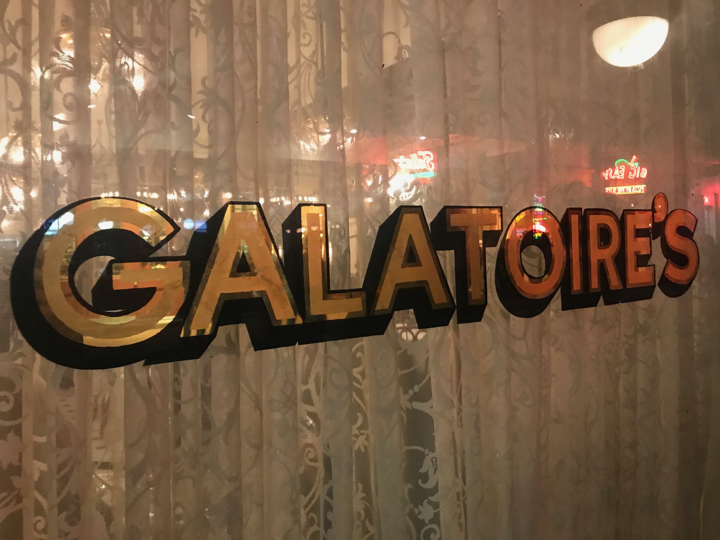
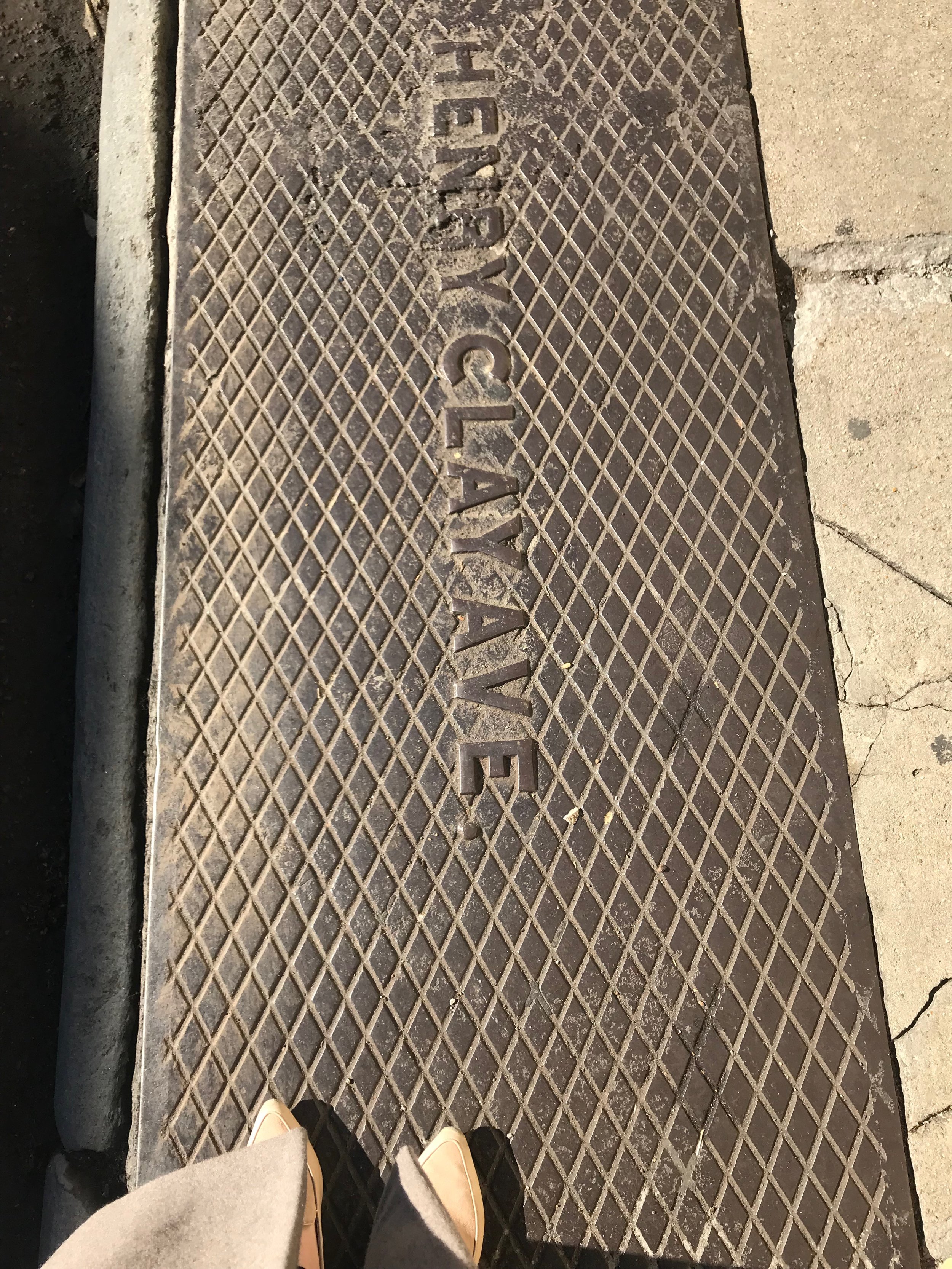
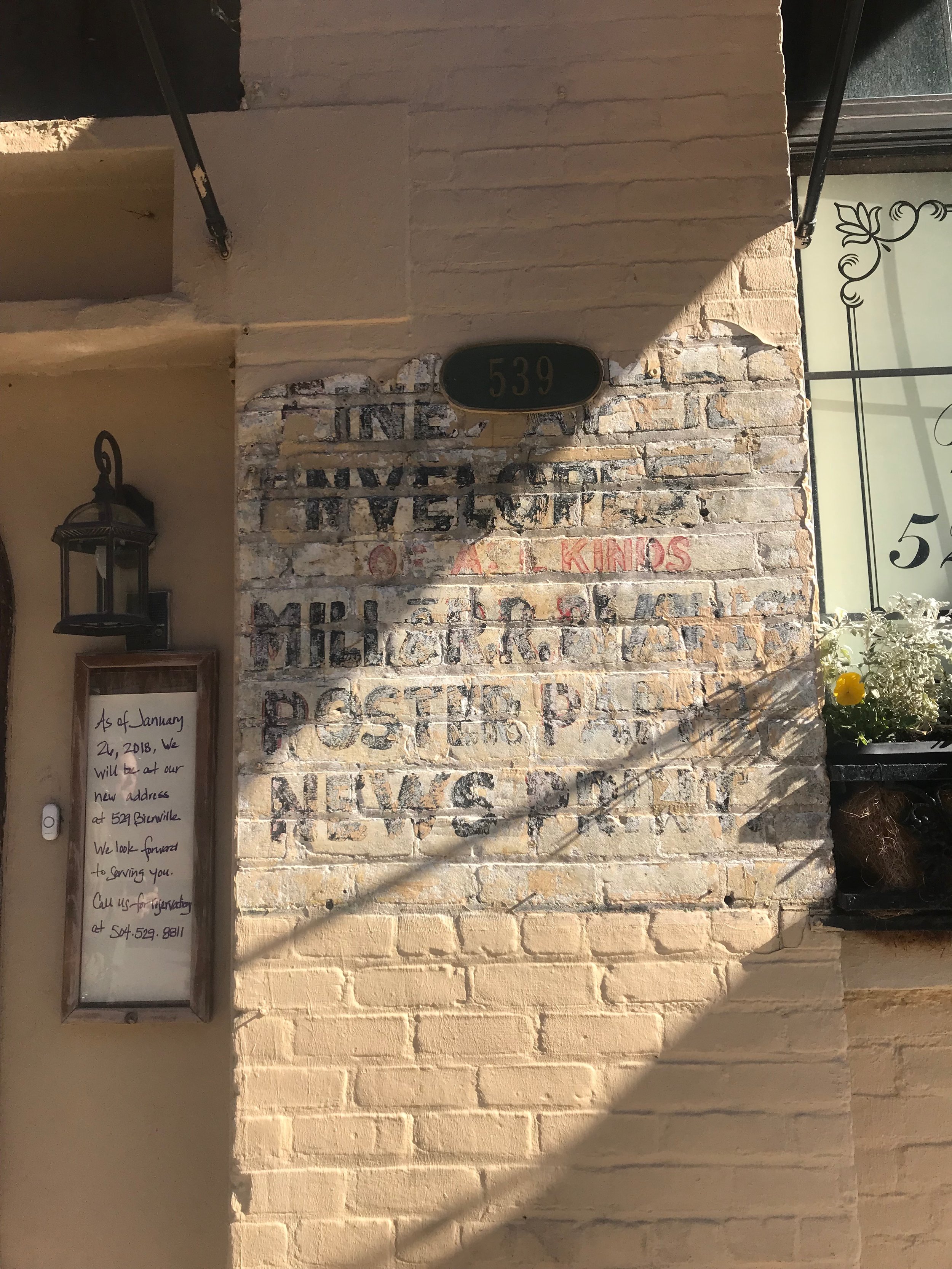
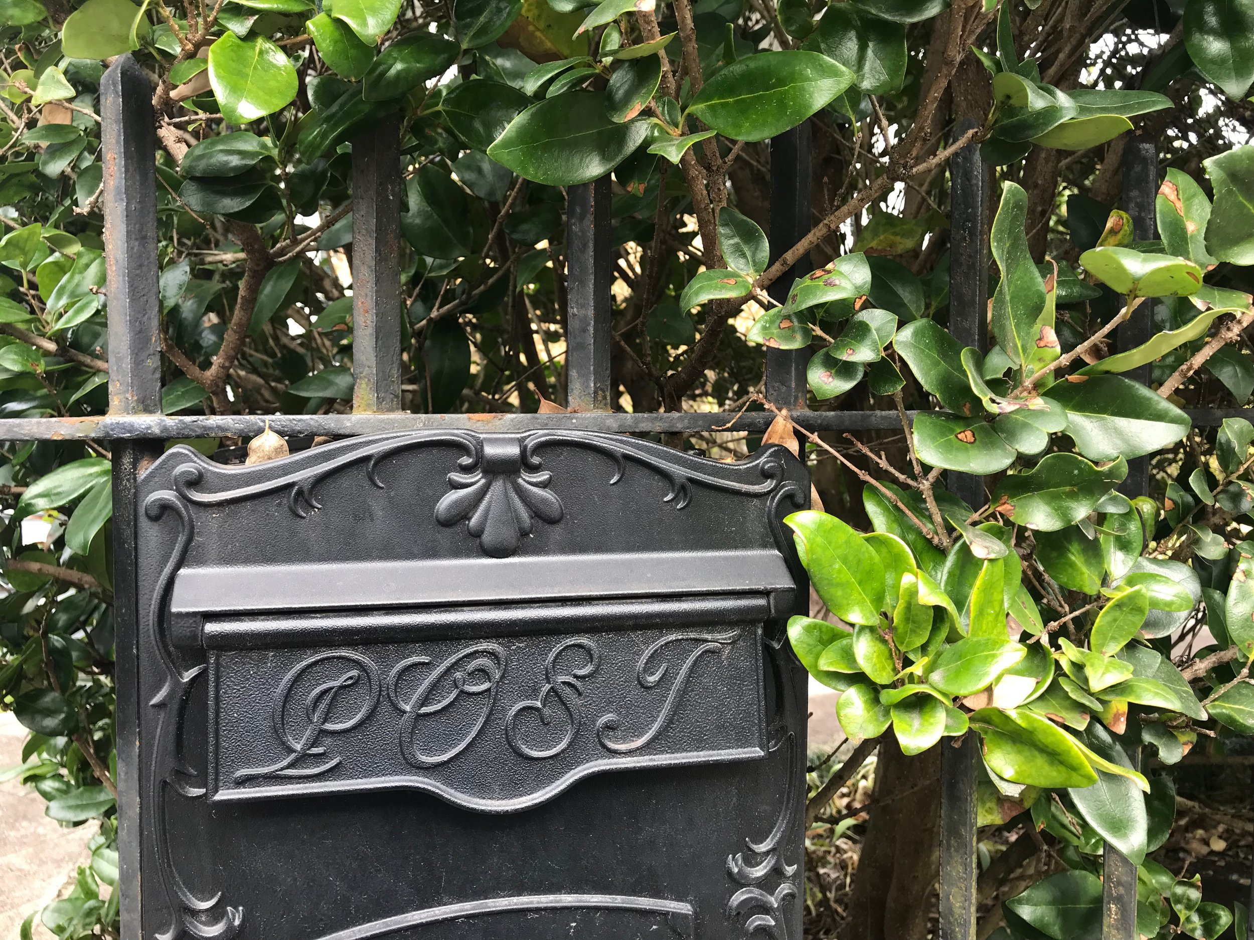
Environmental lettering spotted around New Orleans
New Orleans, without a doubt, is a city of history. When I visited in February of this year with the ladies of The Cottage Rose, we stayed in the French Quarter. And I am here to tell you, it is beaming with beautiful examples of environmental lettering. There’s in-laid tile lettering, wrought-iron lettering, painted lettering, engraved lettering, neon lettering, gold leaf displays on windows-you name it, I bet there’s an example in New Orleans. I was blown away and couldn’t be more impressed. I’ve posted a round up of some of my favorite examples to share with you.
Fauxtist : Process of a Project, Part 1
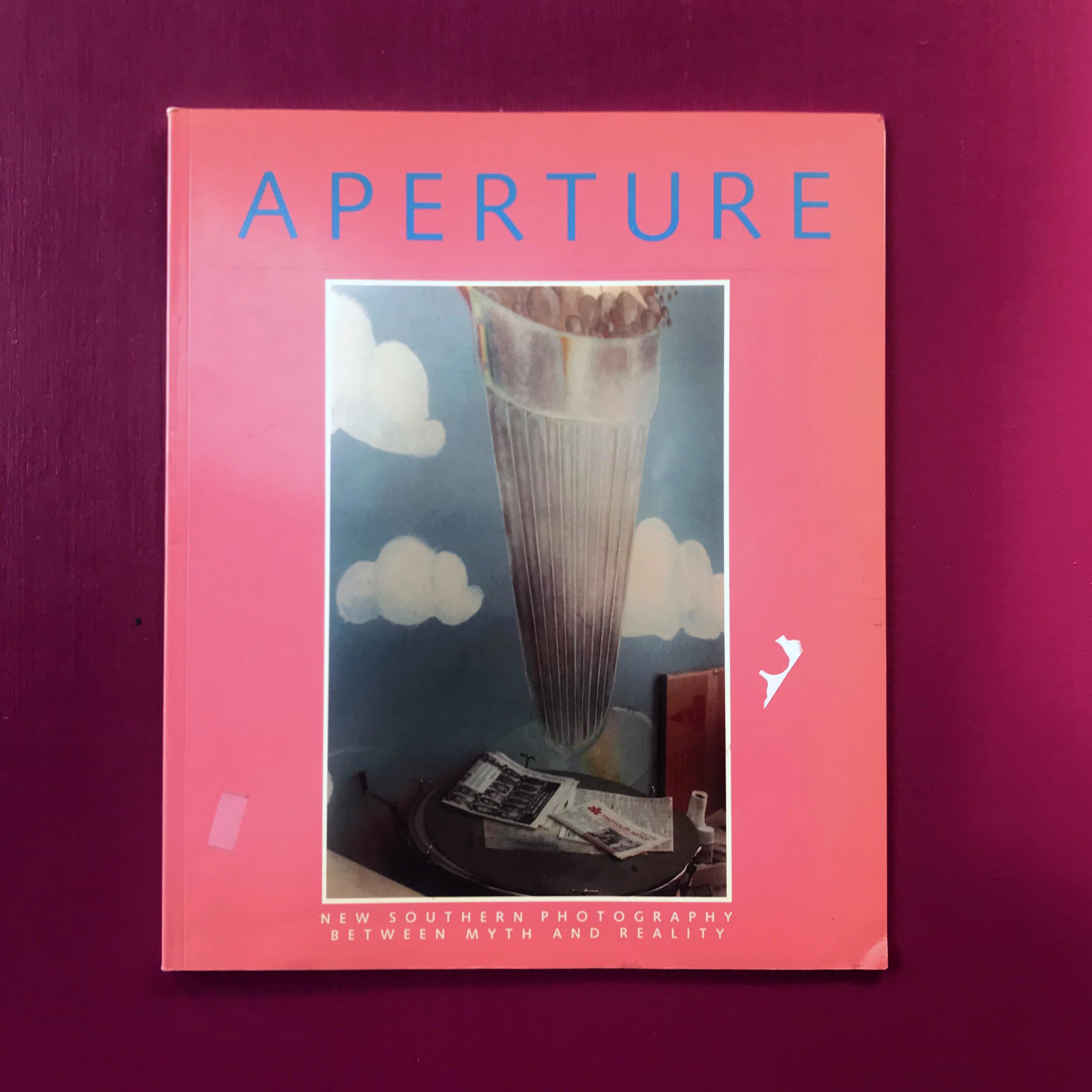
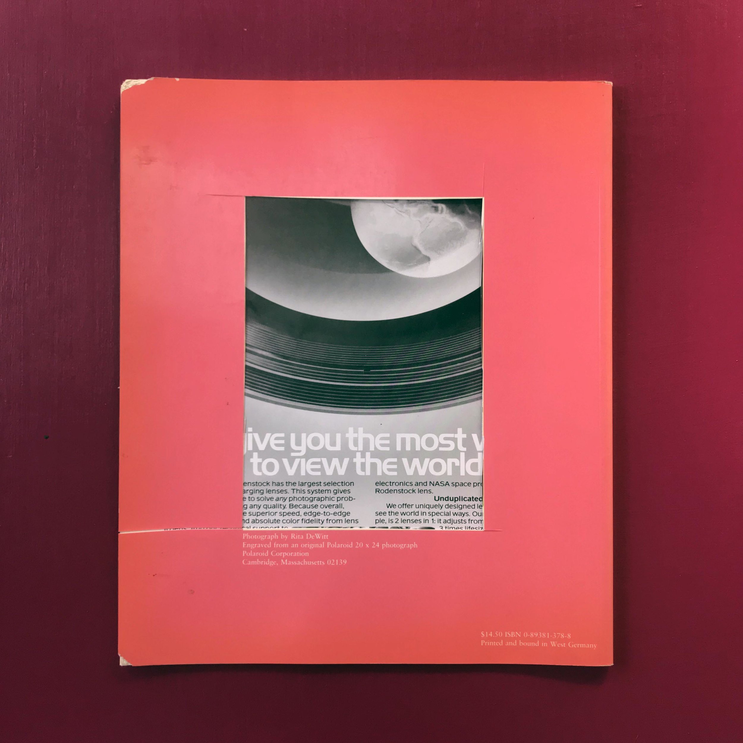
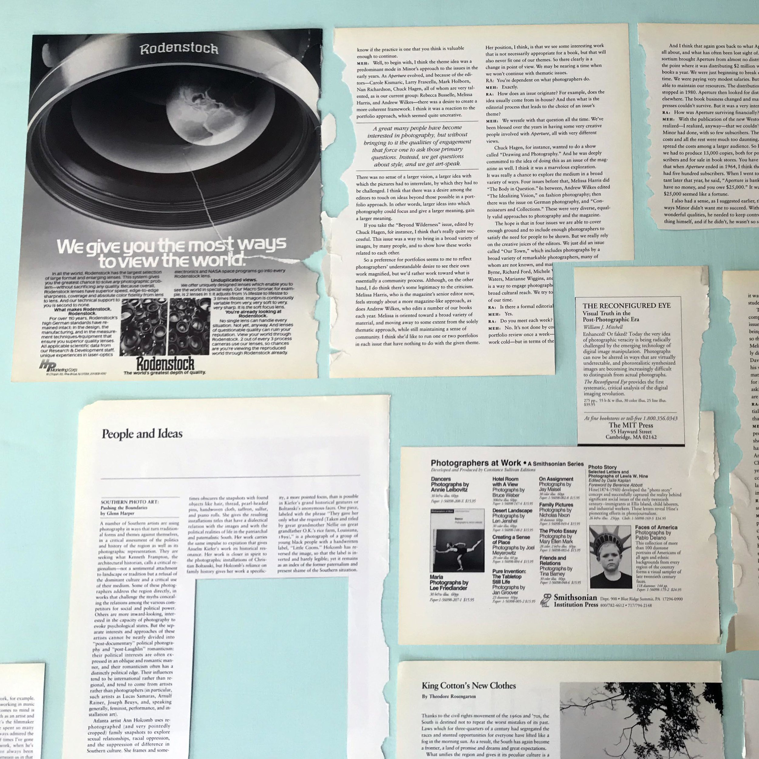
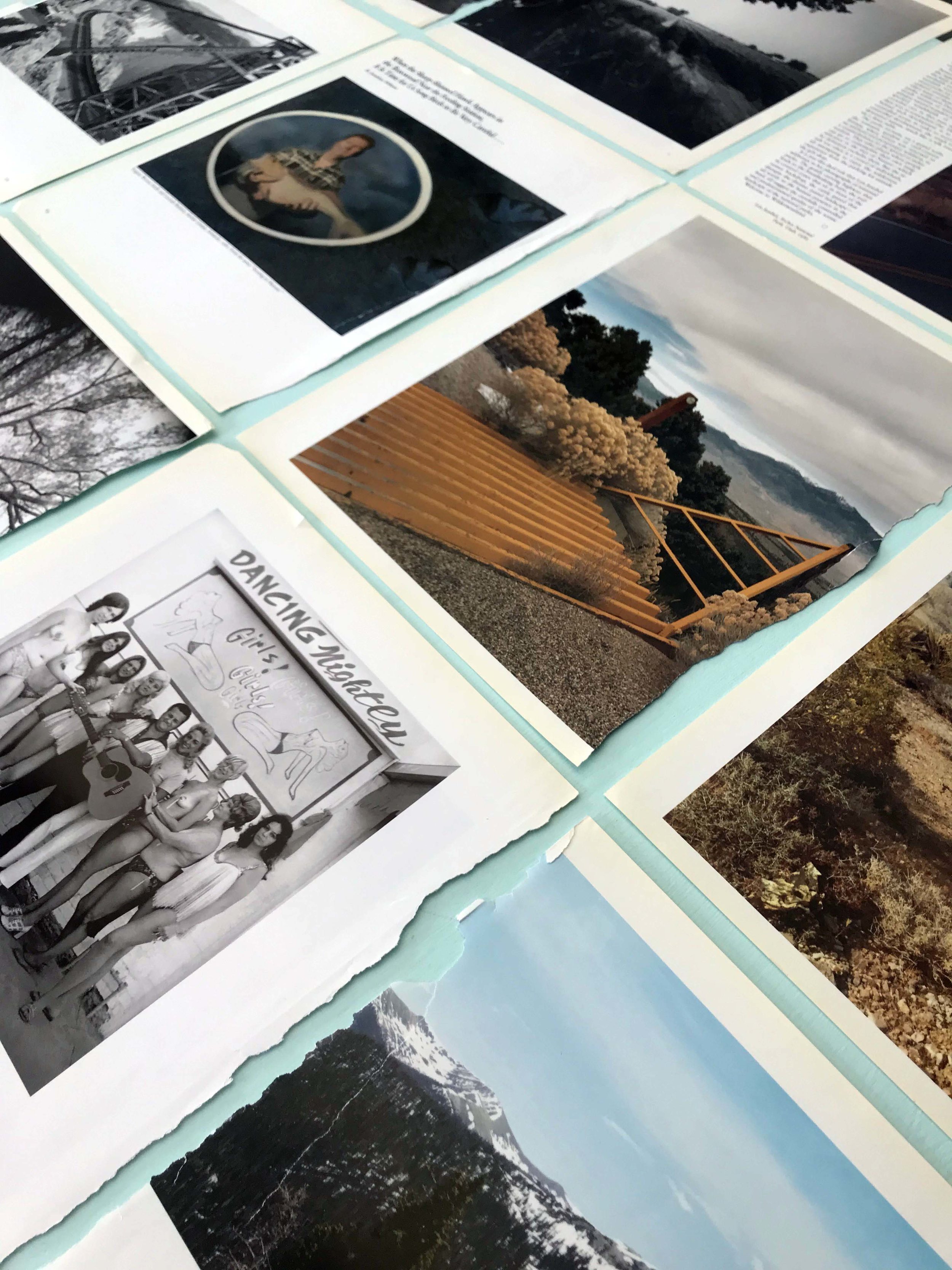
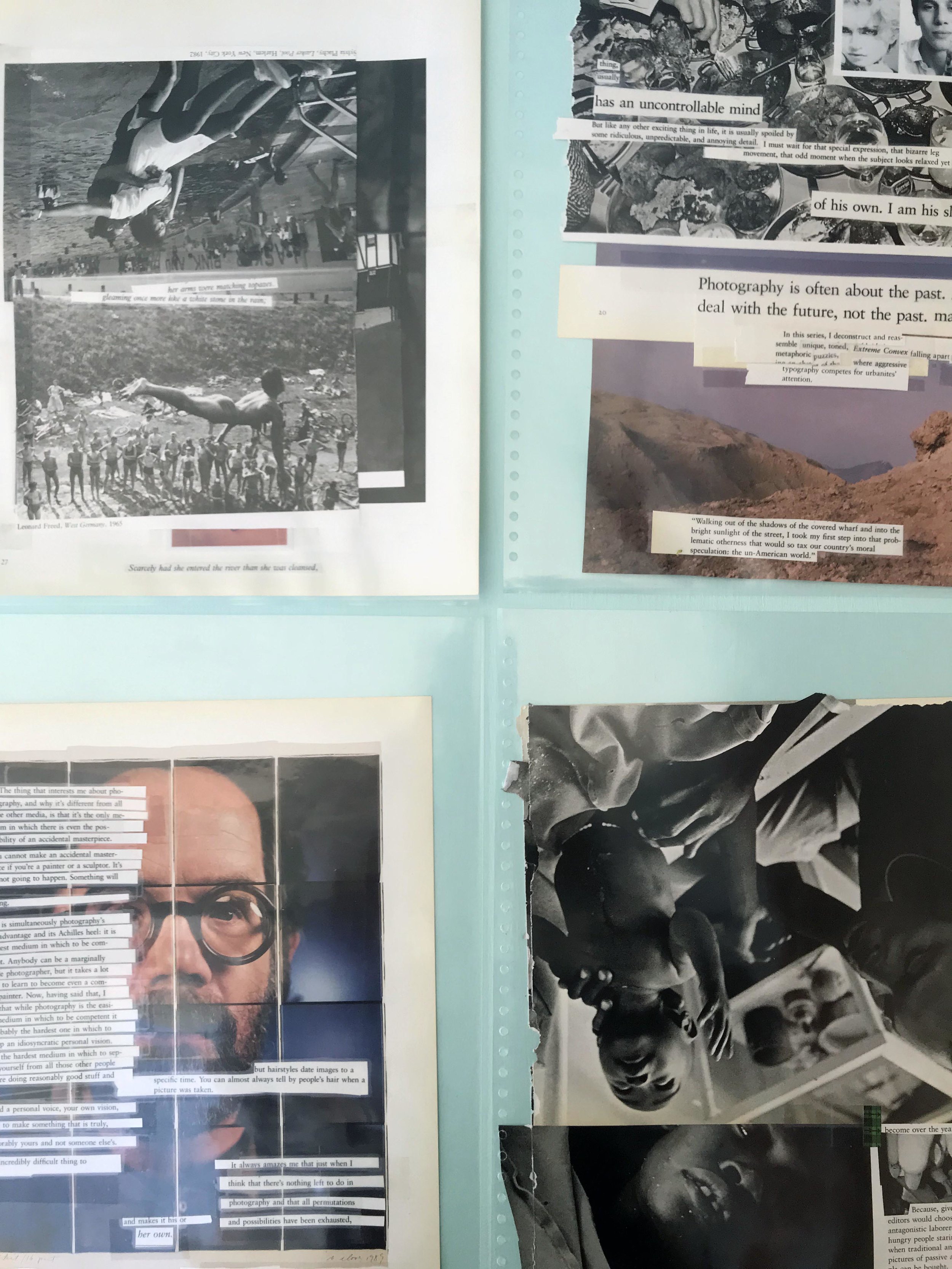
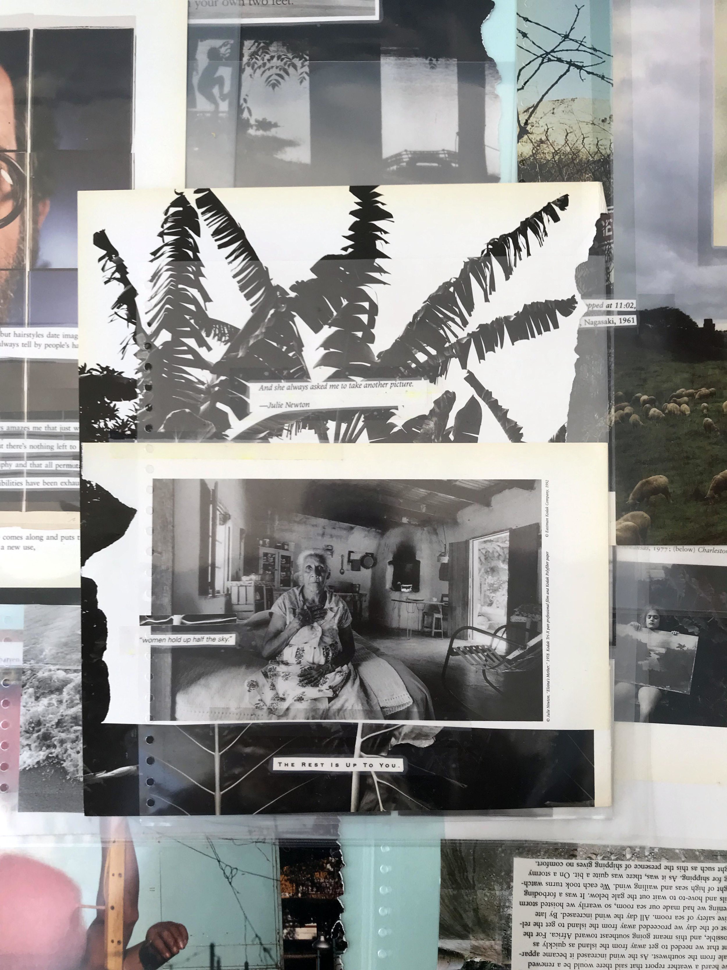
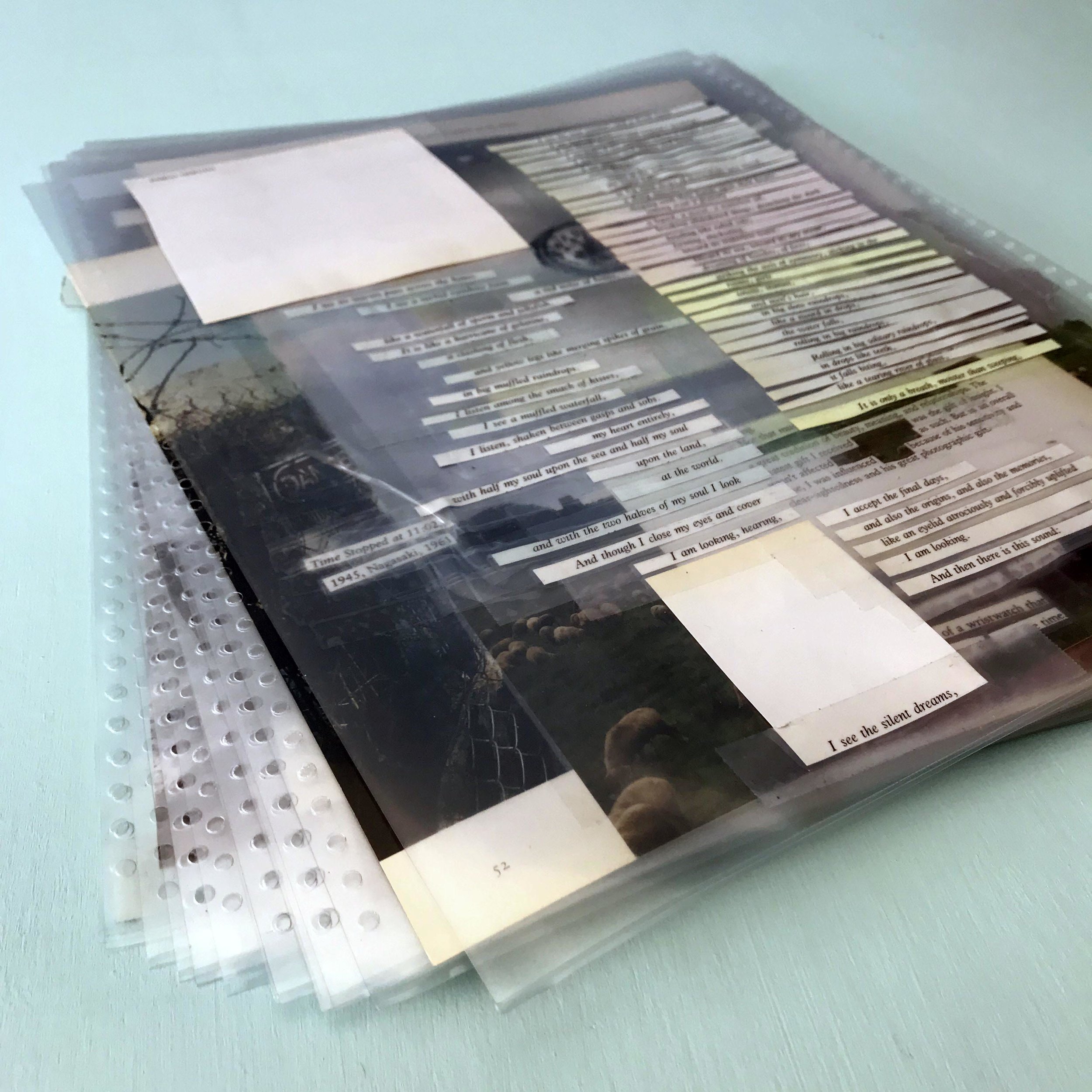
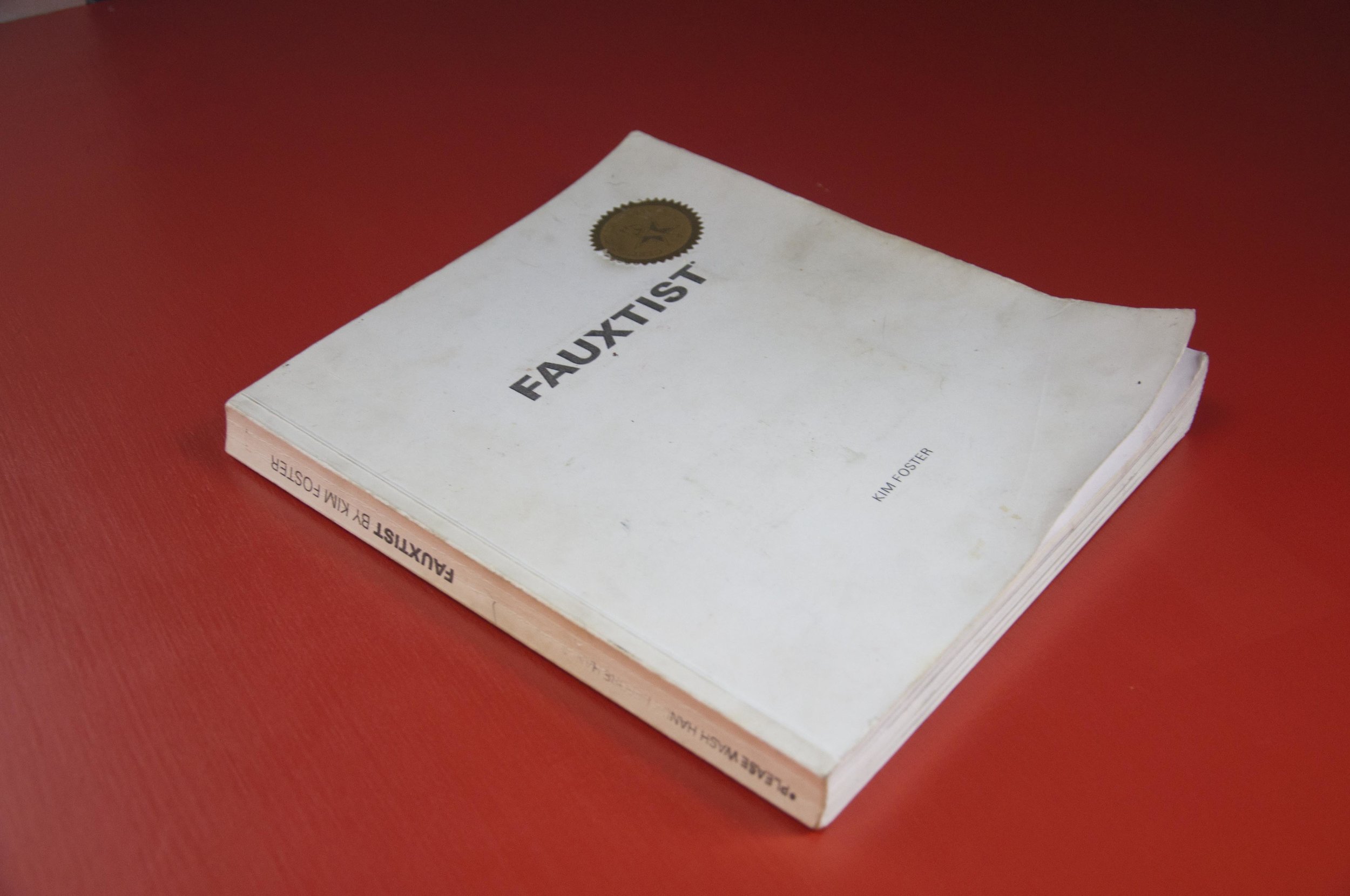
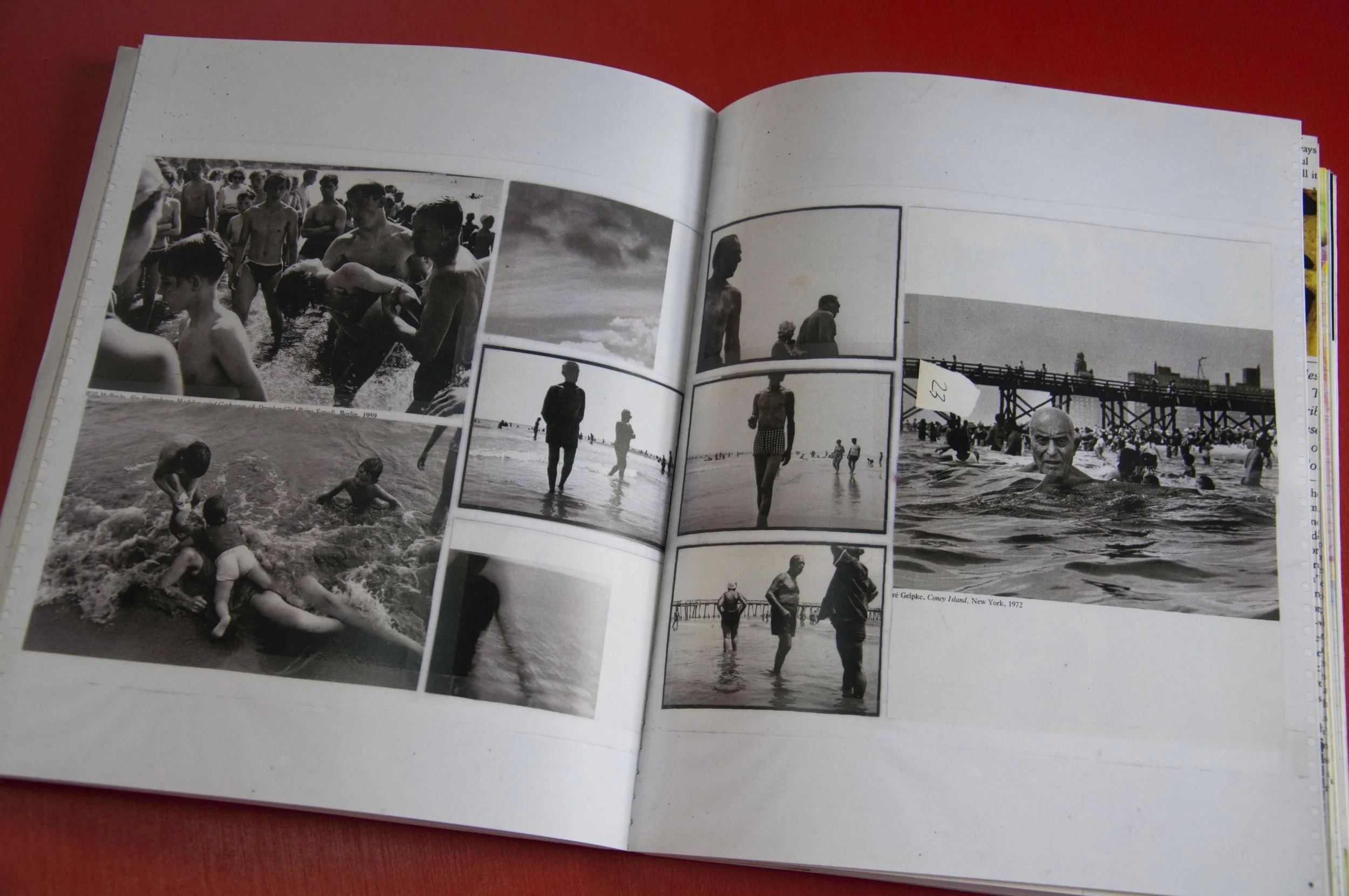
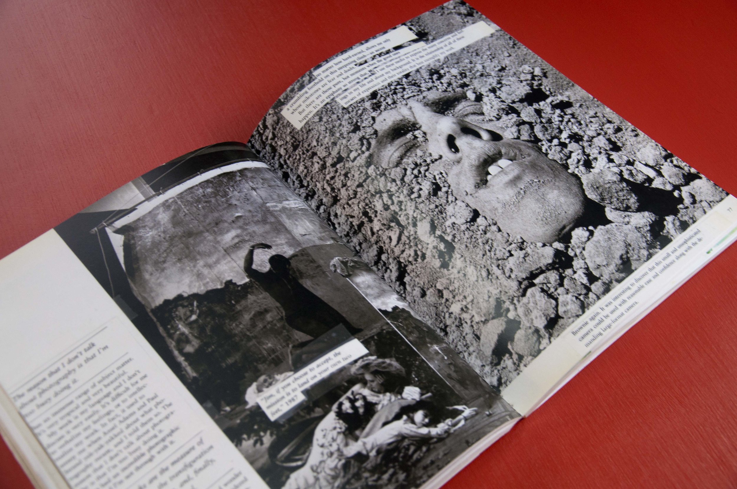
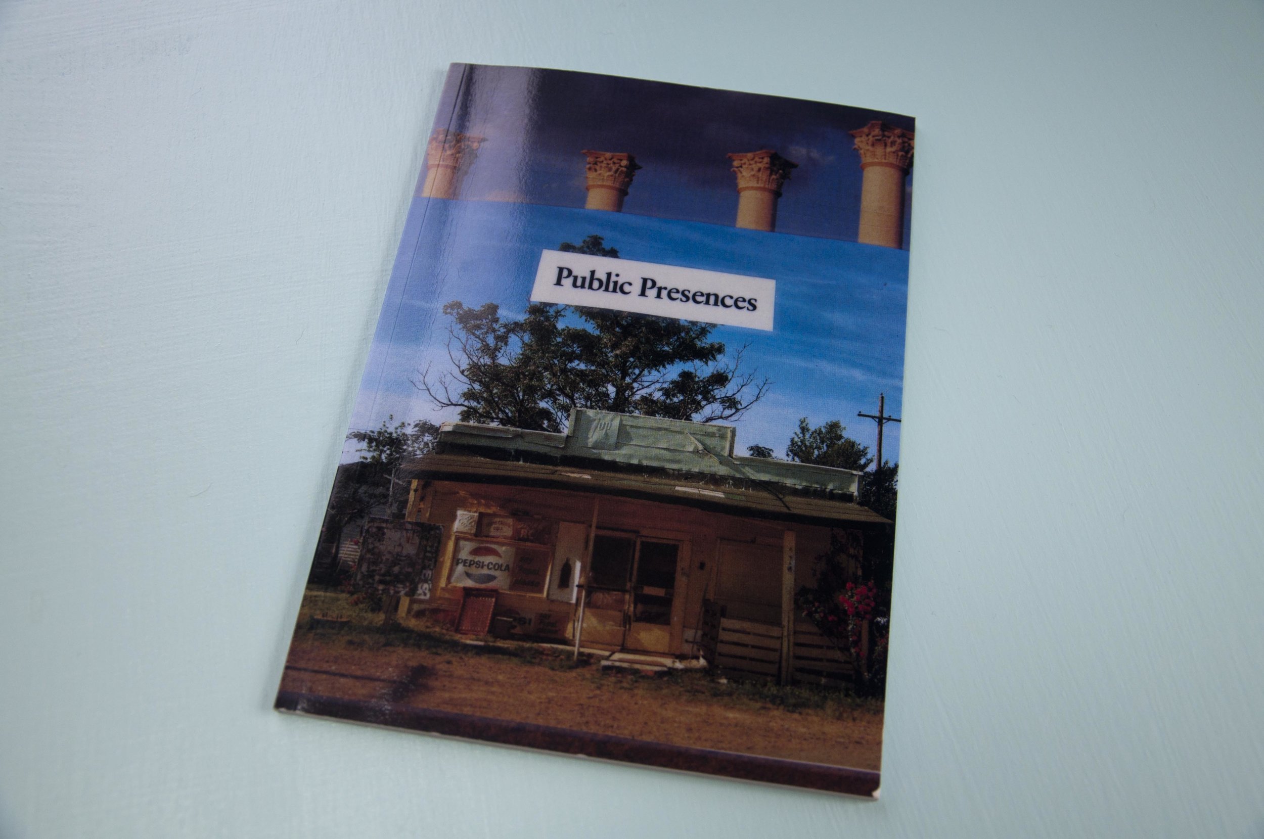
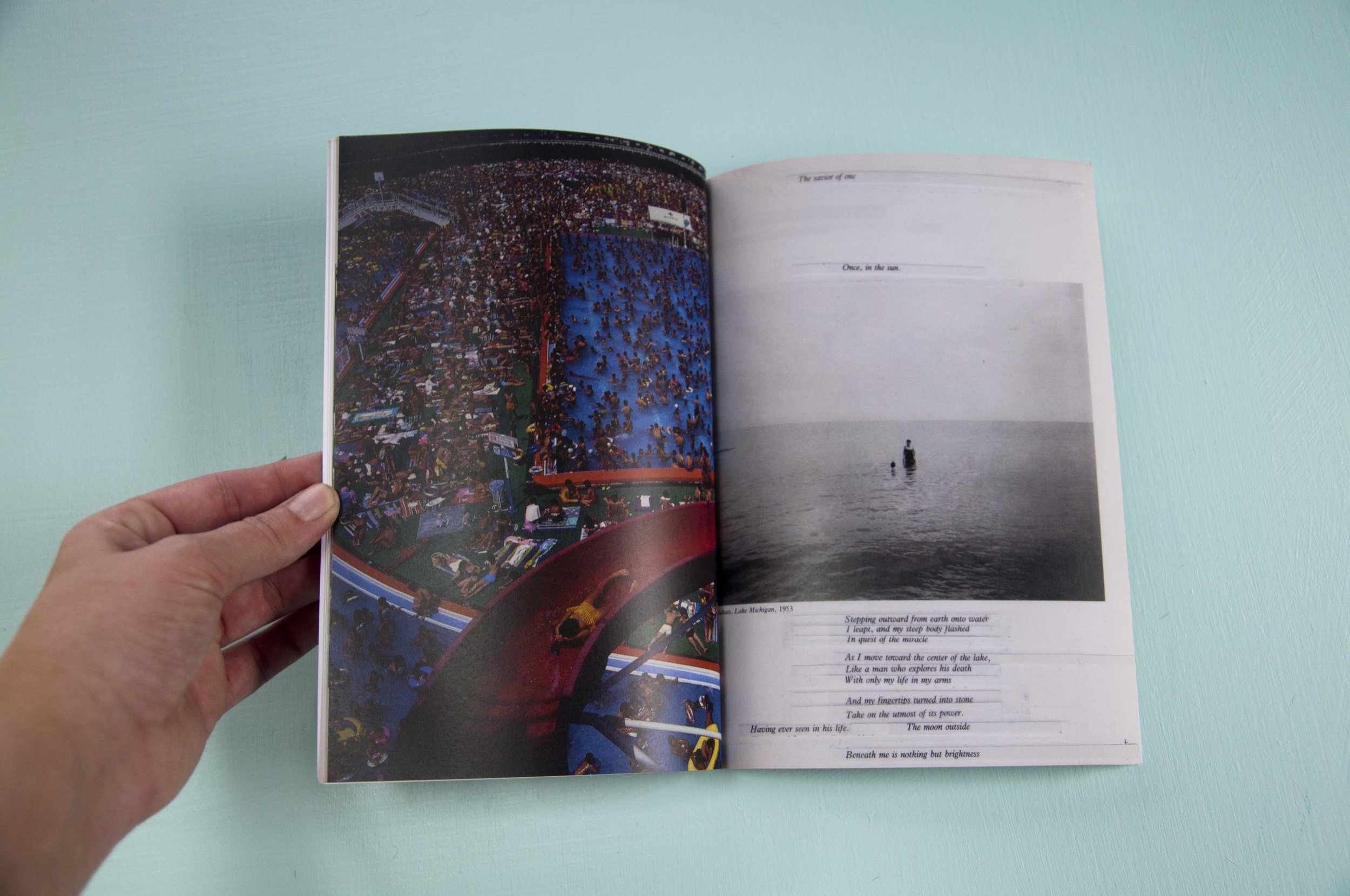
My senior thesis took many, many forms. One final product was my book Fauxtist, which was later made into a much more digestible version titled Public Presences. It started as four Aperture Magazines from the late 1980s and early 1990s. I found them on the main floor of my apt building, where I often found art books on their way to a new home. These four magazines contained both photography and poetry, each had their own theme: Swimmers, New Southern Photography, 40th anniversary & Beyond Wilderness. I ripped pages out the magazines that spoke to me and then cut those pages up further. I kept poetry lines together but completely mixed lines to create new stories paired with new images. This project is near and dear to me as I created each collage to stand on its own. After creating all the pages, I worked on creating the order in which they would be bound together. This process was filled with shuffling together and spreading out the pages until they felt just right. And at a later date, I took the 120-ish page book and created a smaller 20 page version, I titled Public Presences. If you wish to own your own bit of Fauxtist or Public Presences, I have quite a few of my favorite pages available as prints and other goods on Redbubble.com
Welcome and a little bit about LTRS,etc!
Welcome to the LTRS etc Blog!
This is where I (Kim Foster) will explore my ideas relating to typography and other arts. It will be part real world inspiration, part history, part beautiful letters. I will share my projects with you as well as the trials and tribulations of solving these typographic challenges. I love history because it really paints a picture of how things change or why they don’t change. And the more bizarre the history the better.
If you wanted stay up to date with new posts and local workshops, sign up for the LTRSetc email list!
Kim with Felix Gonzalez-Torres installation at MOMA
Process photo of Pennsylvania’s Motto

